Here is shown my contents page 'mock up'. As shown below my mock up is another contents page magazine, i was inspired by looking at this and i am going to try and create my magazine to be very similar to this.
Monday, 22 April 2013
Sunday, 21 April 2013
Double Page Spread Photo Edits
For this image I used photo shop to edit it. I used the polygon lasso tool and highlighted the background of the image, I then used the gradient tool to change the colour of the background to white faded into blue.
Front Cover of Magazine
This is my first design of my front cover. I have used the blue, white and black colour scheme as I feel it looks very good when they are all used together. I created this front cover by using photo shop. I first of all created my main image and background then started putting everything else on top it them. I created the text by using cool text, i looked through a variety of texts and believe these where the best ones for my magazine.
This is my second draft of my front cover. I felt that the stars next to the main heading on the page were slightly tacky and did not look that good so i got rid of them completely off the page. I then made the bar code smaller to make it look more professional. I also made the MAST HEAD bigger to make it stand out more from the rest of the page as i believe it also looks better.
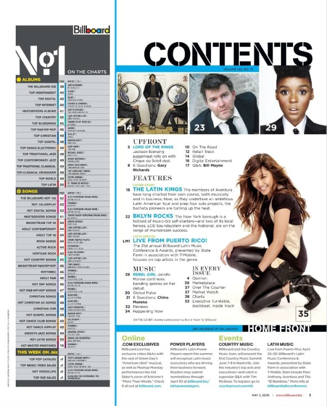
Photo Edits
This is the image I will be using for my front cover, to edit this image I used the program photo shop. The first thing I did was crop it using the 'crop tool' this was to just generally make the image look better. I then used the polygon lasso to highlight the person in the image, after that i changed the images adjustments to black and white which is very simple. I then did the same for the background, but instead making it black and white I edited the image by using the colour balance tool and changed it to a blue background. to finish it off i made the image brighter to give the person a shine on there face as I think it makes them look better.
Subscribe to:
Posts (Atom)


