Monday, 29 April 2013
Target Audience evaluations and opinions of my Music Magazine Double Page Spread
http://padlet.com/wall/mk9ms8l3wj
I have created this wall to get any extra feedback or opinions from my target audience on what they think of my final T10T magazine double page spread.
Target Audience evaluations and opinions of my Music Magazine Contents Page
http://padlet.com/wall/zz12kqifbh
I have created this wall to get any extra feedback or opinions from my target audience on what they think of my final T10T magazine contents page.
Target Audience evaluations and opinions of my Music Magazine FRONT COVER
Created with Padlet
I have created this wall to get any extra feedback or opinions from my target audience on what they think of my final T10T magazine front cover.
Friday, 26 April 2013
Thursday, 25 April 2013
Final Double Page Spread

Final Contents Page

This is now my final version on my contents page, after going through my other versions I have now put this final version together as I feel that it looks best in this way.
 I took inspiration from this NME magazine but still using my colour scheme, of the blue, black and greys. I have made it similar with having my main heading at the top then all of the news down the right hand side of the page. I have put a 'Chart List' down the side of the left hand side of the page as I though this would be very effective due to it being a 'Charts' music magazine. I also got the idea of adding the 'subscribe' to this magazine box at this bottom as it makes it seem more realistic.
 FINAL FRONT COVER

 As you can see the front covers are both very similar, I have used the blue, grey, black and white theme as I think It looks really good. I have listed names of artists down the side of the page just like this vibe front cover but I have made mine much bigger so that it stands out more to give it more of a professional look to it.
Monday, 22 April 2013
Contents Page


Contents Page Mock Up
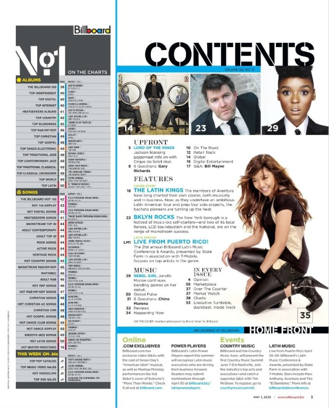
Here is shown my contents page 'mock up'. As shown below my mock up is another contents page magazine, i was inspired by looking at this and i am going to try and create my magazine to be very similar to this.

Sunday, 21 April 2013

Double Page Spread Photo Edits


Front Cover of Magazine


This is my second draft of my front cover. I felt that the stars next to the main heading on the page were slightly tacky and did not look that good so i got rid of them completely off the page. I then made the bar code smaller to make it look more professional. I also made the MAST HEAD bigger to make it stand out more from the rest of the page as i believe it also looks better.

Photo Edits

This is the image I will be using for my front cover, to edit this image I used the program photo shop. The first thing I did was crop it using the 'crop tool' this was to just generally make the image look better. I then used the polygon lasso to highlight the person in the image, after that i changed the images adjustments to black and white which is very simple. I then did the same for the background, but instead making it black and white I edited the image by using the colour balance tool and changed it to a blue background. to finish it off i made the image brighter to give the person a shine on there face as I think it makes them look better.
Mast head ideas for magazine
The following masthead i designed where created using www.cooltext.com where i looked through each text design and picked my two favourite which i felt would go best with my magazine.

 I decided to go with the bottom design as i felt it was the most necessary for my magazine, it is bold and which and on a blue background it will stand out very well compared to the rest of the magazine front cover.


Photo Shoot Images

Photo Shoot Planning for my magazine
I have planned to do my photography shoo for my chart music magazine on the 3rd of April. I have will be using my friend to take photos of her for my front cover which will be taking on a plain wall at my house. This took a while asi had to try taking the photo in all different angles trying to find the best shot for my magazine. I then took another friend of mine to a bridge overlooking the country side trying to get an image with a great view behind her. This went very well as it only took to shots to get the best possible image. Last of all i got more of my friends to come to my house so i can take photos of them generally just messing around so i could catch them in action and also to give it an unplanned effect to the photo. I have been inspired by vibe magazine, i have looked through its magazines and it has helped me to decide what type of shots i want for my magazine.
Contents Page analysis

Double Page Spread Analysis


Magazine front pages analysis


Name ideas for my magazine
The type of things I thought of when trying to find a name for my chart music magazine were:
sound
music
charts
tunes
top 10
beat
loud
With all of these words I came up with possible magazine names as shown below:
TOPMusic
T10T
TUNE
The final name i decided to call my magazine was 'T10T' which stands for 'Top 10 Tunes'. I chose this name as I think it is very simple yet clever to call a chart music magazine.
Subscribe to:
Comments (Atom)