Monday, 29 April 2013
Target Audience evaluations and opinions of my Music Magazine Double Page Spread
http://padlet.com/wall/mk9ms8l3wj
I have created this wall to get any extra feedback or opinions from my target audience on what they think of my final T10T magazine double page spread.
Target Audience evaluations and opinions of my Music Magazine Contents Page
http://padlet.com/wall/zz12kqifbh
I have created this wall to get any extra feedback or opinions from my target audience on what they think of my final T10T magazine contents page.
Target Audience evaluations and opinions of my Music Magazine FRONT COVER
Created with Padlet
I have created this wall to get any extra feedback or opinions from my target audience on what they think of my final T10T magazine front cover.
Friday, 26 April 2013
Thursday, 25 April 2013
Final Double Page Spread

Final Contents Page

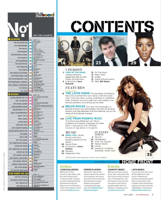
This is now my final version on my contents page, after going through my other versions I have now put this final version together as I feel that it looks best in this way.
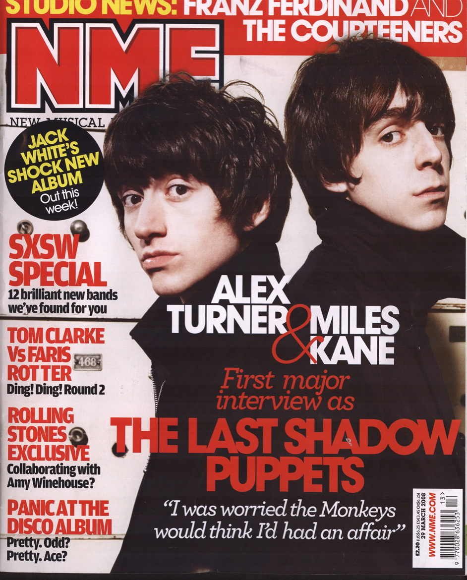
 I took inspiration from this NME magazine but still using my colour scheme, of the blue, black and greys. I have made it similar with having my main heading at the top then all of the news down the right hand side of the page. I have put a 'Chart List' down the side of the left hand side of the page as I though this would be very effective due to it being a 'Charts' music magazine. I also got the idea of adding the 'subscribe' to this magazine box at this bottom as it makes it seem more realistic.
 FINAL FRONT COVER

 As you can see the front covers are both very similar, I have used the blue, grey, black and white theme as I think It looks really good. I have listed names of artists down the side of the page just like this vibe front cover but I have made mine much bigger so that it stands out more to give it more of a professional look to it.
Monday, 22 April 2013
Contents Page


Contents Page Mock Up
Here is shown my contents page 'mock up'. As shown below my mock up is another contents page magazine, i was inspired by looking at this and i am going to try and create my magazine to be very similar to this.

Sunday, 21 April 2013

Double Page Spread Photo Edits


Front Cover of Magazine


This is my second draft of my front cover. I felt that the stars next to the main heading on the page were slightly tacky and did not look that good so i got rid of them completely off the page. I then made the bar code smaller to make it look more professional. I also made the MAST HEAD bigger to make it stand out more from the rest of the page as i believe it also looks better.

Photo Edits

This is the image I will be using for my front cover, to edit this image I used the program photo shop. The first thing I did was crop it using the 'crop tool' this was to just generally make the image look better. I then used the polygon lasso to highlight the person in the image, after that i changed the images adjustments to black and white which is very simple. I then did the same for the background, but instead making it black and white I edited the image by using the colour balance tool and changed it to a blue background. to finish it off i made the image brighter to give the person a shine on there face as I think it makes them look better.
Mast head ideas for magazine
The following masthead i designed where created using www.cooltext.com where i looked through each text design and picked my two favourite which i felt would go best with my magazine.

 I decided to go with the bottom design as i felt it was the most necessary for my magazine, it is bold and which and on a blue background it will stand out very well compared to the rest of the magazine front cover.


Photo Shoot Images

Photo Shoot Planning for my magazine
I have planned to do my photography shoo for my chart music magazine on the 3rd of April. I have will be using my friend to take photos of her for my front cover which will be taking on a plain wall at my house. This took a while asi had to try taking the photo in all different angles trying to find the best shot for my magazine. I then took another friend of mine to a bridge overlooking the country side trying to get an image with a great view behind her. This went very well as it only took to shots to get the best possible image. Last of all i got more of my friends to come to my house so i can take photos of them generally just messing around so i could catch them in action and also to give it an unplanned effect to the photo. I have been inspired by vibe magazine, i have looked through its magazines and it has helped me to decide what type of shots i want for my magazine.
Contents Page analysis

Double Page Spread Analysis


Magazine front pages analysis


Name ideas for my magazine
The type of things I thought of when trying to find a name for my chart music magazine were:
sound
music
charts
tunes
top 10
beat
loud
With all of these words I came up with possible magazine names as shown below:
TOPMusic
T10T
TUNE
The final name i decided to call my magazine was 'T10T' which stands for 'Top 10 Tunes'. I chose this name as I think it is very simple yet clever to call a chart music magazine.
Monday, 25 March 2013
Chart Magazine Mood Board

These images represent what i think is involved with chart music, these are the type of artists etc. i feel would be linked to this genre.
Deyes Magazine front cover/contents


This is my contents page for my Deyes Magazine. To make this contents page look professional I added the page guides so that it looked very neat. Also to make my images stand out i added borders around them which i feel is very affective.
Monday, 11 March 2013
Magazine Photos

Sunday, 10 March 2013
Photoshop Practice


Here is my first attempt of photoshop. I used the 'polygonal lasso tool' tool to select each part of the picture where I have then changed the colour of certain parts. For example the main focus of the image is the reflection of the woman in the mirror where I have changed it to black and white. I also used the same tool and then changed the colour of the woman's dress to pink etc.
Friday, 8 March 2013
Feminist Theory
Feminist Theory
Laura Mulvey is a feminism theorist who wrote an article that she believed women in Hollywood Films were a figure of desire and men were more dominant in the roles they played as were the spectators. In the time and era of classical Hollywood Films the audience of the film were encouraged to identify the protagonist of the film which usually was men in Hollywood Films.
Shown below is what she thought in her theory;
Fetishistic – Seeing women as icons etc such as Beyonce
Laura Mulvey is a feminism theorist who wrote an article that she believed women in Hollywood Films were a figure of desire and men were more dominant in the roles they played as were the spectators. In the time and era of classical Hollywood Films the audience of the film were encouraged to identify the protagonist of the film which usually was men in Hollywood Films.
Shown below is what she thought in her theory;
Voyeuristic – Seeing a woman as a whore in a movie etc.
Fetishistic – Seeing women as icons etc such as Beyonce
These terms are two modes of ‘male gaze’ of the time of classical Hollywood Films which Laura Mulvey suggested in her theories.
Male Gaze – This is seen in films to put woman into perspective of a heterosexual man. An example of this is when they show off a womans curves in a scene.
Richard Dyer's Star Theory
Richard Dyer's Star Theory
Richard Dyer has a Star Theory that the media create all 'Stars'. This gets a person's name well and truly known to media institutions and this can become quite critical to their careers.
Paradox: A Paradox is the idea that two things go together but these two things should really go together.
Incoherence: An Incoherence is when you buy a certain artists products. An example of this could be when you buy a t-shirt produced by the artist. Cd's arn't as common now-a-days and people usually buy all of the artist music online or on itunes etc.
Cohens Moral Panic Theory
Cohen's Morel Panic is believed to be a social group or the media that come across as a threat to society. This also involves the controlling of folk devils in society.
Concern: The behaviour of a particular group represented as having threat to society.
Volatility: Panics erupt dramatically but are difficult to sustain and there will be a negative consequence for the rest of us.
Hostility: 'Folk Devils' are constructed to create a clear divide between "them" and "us".
Consensus: Widespread acceptance of the threat posed by this group. Not necessarily reflecting national concern, but the campaigner will be very vocal whilst the opposition will be weak and disorganised.
Disproportionality: Wild exaggeration of evidence. Not only the number of people involved but also the scale of the problem.
The Rule of Thirds
The Rule of Thirds is a guideline that divides an image into 9 equal segments using 2 horizontal and 2 vertical lines. It is important that certain elements are placed on the lines. The rule of thirds is applied by aligning a subject with the guidelines and intersection points. The subject will be placed on the horizon, top or bottom line. This allows linear features in the image to flow one section to another. The main reason that the rule of thirds is used is so the horizon is prevented from dividing and splitting the image in half. This is also used to hide the horizon line. I will try to use the rule of thirds in my photography when taking photos for my Deyes Magazine and My Main Magazine as well.
 In most people shots, the main line of interest in the captures picture is the line going through the eyes.
In most people shots, the main line of interest in the captures picture is the line going through the eyes. Thursday, 28 February 2013
Newsletter Mock Up


Here are my mock ups for my front cover and contents of my new Deyes High School newsletter.
Image Research Around School
I have taken images from around the school but I still need to upload them onto my users so this is unfinished.
Newsletter
The Deyes High School newsletter is colour coded and matches the school colour theme, these are blue, red, black, white and yellow. This gives a much more professional look to the newletter and by the amount of different colours used in this, it will appeal alot more to a younger audience.
Throughout the newsletter the same font is used to make it look more professional, whereas if it used alot of different fonts of every page, it will not look as good and possibly look childish. The type of font used in this newsletter shows high levels of formality as it is using bold/ bigger text for the title and then smaller text to show what the person is reading about. People could argue and say it may look better if they used other fonts throughout the newsletter to make it look more enticing to read. But, I believe since it is a school, they should have the same font throughout as it makes it look alot more professional.
In this newsletter images are also used which will make it look better. The main image on the front cover is an image of the head teacher which shows she is the most powerful person in the whole school. Other images are used in the newsletter throughout it such as images of students, drama etc. Their are also image advertisements in the news letter trying to encourage students/parents to go and watch a drama performance in the school. The logo is also used in the newsletter to clearly show what school it is.
The Deyes High School logo and name are used at the top of the newsletter to show that it is offical and proffesional. It shows what school it is because without it the reader would know what school it was.
The text in the newsletter is seperated in paragraphs, sone large and some small. This is so the reader doesn't get bored of reading pages of texts and makes them wants to carry on reading the rest.
Overall, i think the newsletter is very good, but it could do with some slight changes to make it abit more enticing to the reader, this is what I will do which will be show on the next few blog posts.

Monday, 4 February 2013
Music Magazine Genre's
In the music industry, there are hundreds of different genre's. There all tons of different music magazines that are available. The list below shows all of the different types of music magazine genres;
 Alternative
Folk
Funk
Gospel
Gothic
Industrial
Jazz
 Latin
Latin
 Metal
New wave and synthpop
Metal
New wave and synthpop
Opera

Alt-Country
Alternative
Bluegrass
Blues
Christian
Classical
Country
ElectronicFolk
Funk
Gospel
Gothic
Industrial
Jazz
Latin Metal
MetalOpera
Punk and Hardcore
R&B and Soul
Rap and Hip-Hop
Reggae
Rock and Pop
Ska
Surf Rock
Introduction
For the next few months during my media course i will be studying and hopefully producing certain pages on a music themed magazine. By the end of the course i will hopefully have produced a front cover, contents page and double page spread on a music magazine based upon a music genre of my choice. The Genre I have decided to use for my music mag is going to be Chart Music. This has all of the details on new upcoming music. I will also have to complete other various tasks as well which i will be posting regularly to keep you up to date with. I will using a software called Adobe Photoshop which i will be using to edit my photos with.
Subscribe to:
Comments (Atom)